> ## Documentation Index
> Fetch the complete documentation index at: https://docs.thickdot.com/llms.txt
> Use this file to discover all available pages before exploring further.
# Monitor Your Receiving Operations with the Dashboard
> Track real-time receiving metrics, visualize automation trends, monitor your automation rate, and access recent documents from a single operations hub.
The Dashboard gives you an at-a-glance view of your entire receiving operation. From the moment a packing slip enters the system to the instant a goods receipt posts to your ERP, every document's status is reflected here in real time. Use the Dashboard to spot bottlenecks, measure your automation rate, and jump directly into any document that needs attention, without hunting through menus or running manual reports.
## Key Metrics
Four stat cards at the top of the Dashboard summarize the current state of your pipeline. Each card is a live filter, click any card to open the Document Inbox pre-filtered to that segment.
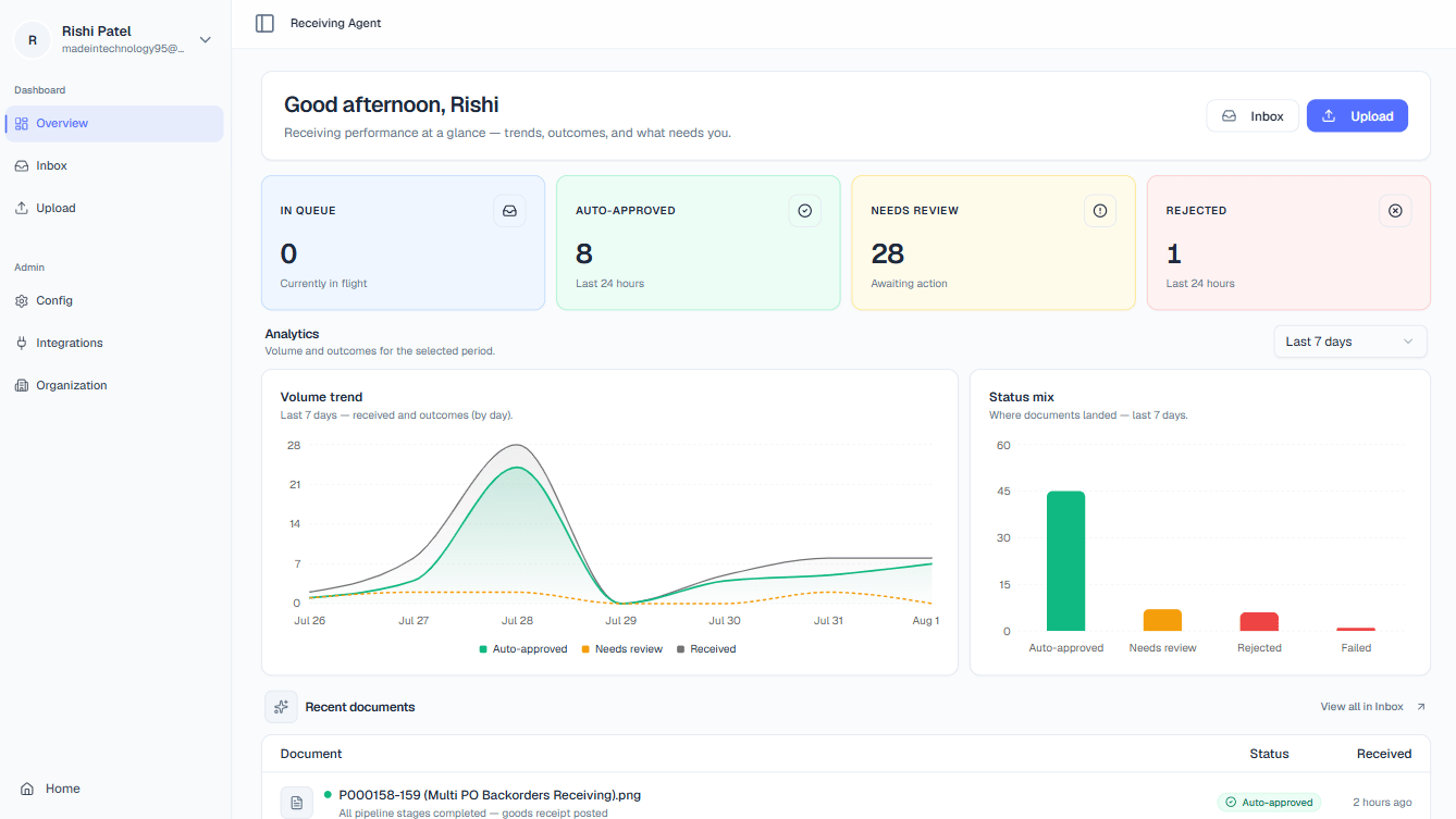 Documents currently being processed by the AI pipeline. A rising count here can indicate a backlog or a high-volume receiving period. Click the card in the app to see every document actively moving through extraction, matching, and validation.
Packing slips that matched their ERP purchase order perfectly in the last 24 hours and were approved without any human intervention. This number is your automation baseline, the higher it is, the less manual work your team is doing.
Documents the AI has flagged for a human decision, typically because of a quantity discrepancy, a low-confidence extraction, or a missing PO match. This is your active to-do list. Click the card in the app to open the review queue.
Documents that a team member rejected in the last 24 hours (for example, illegible scans or documents that are not packing slips). Click to audit rejection reasons and identify recurring problem sources.
## Analytics
The Analytics section sits below the stat cards and gives you two complementary charts for understanding performance over time. Use the time-period selector: **7 days**, **30 days**, **90 days**, or **12 months** to control the window both charts display simultaneously.
### Volume Trend
The Volume Trend chart is a line or bar chart showing how many documents entered the pipeline per day (or per week, at longer time scales). Use it to correlate receiving volume with staffing, identify seasonal spikes, and confirm that your integration is ingesting documents reliably. A sudden drop to zero is a useful early warning that an upstream feed has stalled.
### Status Mix
The Status Mix chart is a donut or pie chart that breaks your document volume into outcome categories: Auto-Approved, Needs Review, Rejected, and still In Queue. The slice you want to grow is **Auto-Approved** - its percentage relative to the total is your **automation rate**, the single most important metric for measuring how much manual effort the platform is saving your team. As you tune confidence thresholds and improve vendor document quality, watch this slice expand.
Use the time-period selector to compare two windows back-to-back. For example, switch between **30 days** and **90 days** to see whether your automation rate is trending upward after a recent configuration change or vendor onboarding.
## Recent Documents
The Recent Documents feed at the bottom of the Dashboard shows the latest documents to enter or update in the system, ordered by most recent activity. It provides a live pulse of your operation without requiring you to open the full Inbox.
Documents currently being processed by the AI pipeline. A rising count here can indicate a backlog or a high-volume receiving period. Click the card in the app to see every document actively moving through extraction, matching, and validation.
Packing slips that matched their ERP purchase order perfectly in the last 24 hours and were approved without any human intervention. This number is your automation baseline, the higher it is, the less manual work your team is doing.
Documents the AI has flagged for a human decision, typically because of a quantity discrepancy, a low-confidence extraction, or a missing PO match. This is your active to-do list. Click the card in the app to open the review queue.
Documents that a team member rejected in the last 24 hours (for example, illegible scans or documents that are not packing slips). Click to audit rejection reasons and identify recurring problem sources.
## Analytics
The Analytics section sits below the stat cards and gives you two complementary charts for understanding performance over time. Use the time-period selector: **7 days**, **30 days**, **90 days**, or **12 months** to control the window both charts display simultaneously.
### Volume Trend
The Volume Trend chart is a line or bar chart showing how many documents entered the pipeline per day (or per week, at longer time scales). Use it to correlate receiving volume with staffing, identify seasonal spikes, and confirm that your integration is ingesting documents reliably. A sudden drop to zero is a useful early warning that an upstream feed has stalled.
### Status Mix
The Status Mix chart is a donut or pie chart that breaks your document volume into outcome categories: Auto-Approved, Needs Review, Rejected, and still In Queue. The slice you want to grow is **Auto-Approved** - its percentage relative to the total is your **automation rate**, the single most important metric for measuring how much manual effort the platform is saving your team. As you tune confidence thresholds and improve vendor document quality, watch this slice expand.
Use the time-period selector to compare two windows back-to-back. For example, switch between **30 days** and **90 days** to see whether your automation rate is trending upward after a recent configuration change or vendor onboarding.
## Recent Documents
The Recent Documents feed at the bottom of the Dashboard shows the latest documents to enter or update in the system, ordered by most recent activity. It provides a live pulse of your operation without requiring you to open the full Inbox.
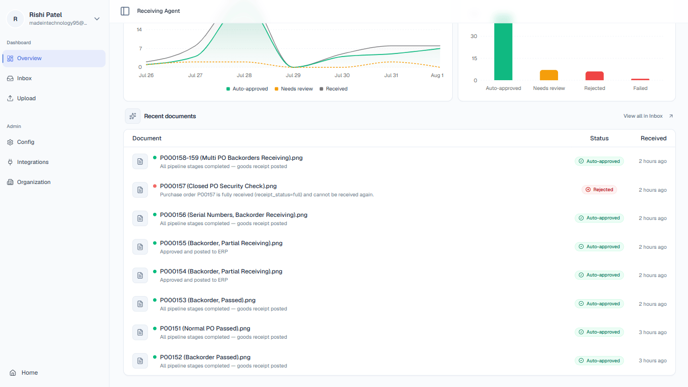 Each row in the feed includes:
| Column | What it shows |
| ------------------ | ------------------------------------------------------------------------------------------------------------------------------------- |
| **Document Name** | The original filename of the uploaded packing slip |
| **Status Badge** | A color-coded label reflecting the document's current state (e.g., Processing, Needs Review, Approved) |
| **Status Message** | A short, human-readable explanation of the current state. For example, *"Quantity discrepancy on Line 2"* or *"Goods receipt posted"* |
| **Received Time** | How long ago the document entered the system, displayed as a relative timestamp (e.g., *"3 minutes ago"*) |
Click any row in the feed to open the full **Document Details** page for that document, where you can inspect extracted data, review AI decisions, and take action.
Each row in the feed includes:
| Column | What it shows |
| ------------------ | ------------------------------------------------------------------------------------------------------------------------------------- |
| **Document Name** | The original filename of the uploaded packing slip |
| **Status Badge** | A color-coded label reflecting the document's current state (e.g., Processing, Needs Review, Approved) |
| **Status Message** | A short, human-readable explanation of the current state. For example, *"Quantity discrepancy on Line 2"* or *"Goods receipt posted"* |
| **Received Time** | How long ago the document entered the system, displayed as a relative timestamp (e.g., *"3 minutes ago"*) |
Click any row in the feed to open the full **Document Details** page for that document, where you can inspect extracted data, review AI decisions, and take action.